

Layer
A modern style e-commerce site that provides confident and efficient apparel shopping experience.
My Role
UI/UX design, Brand design.
Timeline
80 hours
Tools
Sketch, Paper & pen, Illustrator, Photoshop, InVision, Principle, OptimalSort, Zeplin.
Platform
Desktop, tablet, mobile
Introduction
Layer is a fictional clothing retailer needing an easy-to-use e-commerce site and a refreshing brand design to bring their business online. To help Layer create an outstanding user experience, I observed users’ most recent shopping experience, synthesized my research findings to discover user pain points, designed the happy flow and wireframes, and tested my prototype to improve the experience. The outcome is a responsive website and a modern style brand that provides a confident, efficient, and affordable experience to users.
This is my first project practicing UI/UX design skills at Designlab’s UX Academy course. I learned a great deal asking myself why behind every design step and decision.

The Challenges and Solutions
The challenge.
Layer is a clothing store that wanted to bring their business online. They needed our help to create an e-commerce website that is easy to use from any device, along with a updated brand look that is modern, neutral, and fresh.
The solutions.
We designed a clean and sophisticated responsive website that provides a confident, efficient, and affordable experience to users.
The Layer responsive website assists users in choosing desired size and styles; Creates a natural comparing process for users; and highlights essential information such as product details, discount, and shipping/returns policy.
1/ Research
Competitive Analysis and Market Research
Understand the apparel shopping market and trends.
We reviewed appeal shopping trends and analyzed the strengths and weaknesses of our competitor brands to learn the market situation that is driving the growth of online apparel retail. The following are our discoveries:
Customers
Generation Z and Millennials drive the most e-commerce apparel growth in 2019. They cite features like free and fast shipping, low prices, and convenience as the most important features when buying apparel online.
Generation Z and Millennials strongly prefer Amazon and brand websites
Over 63% of Gen Z and 57% of Millennial shoppers purchased clothing from Amazon in the last six months. These shoppers valued two-day shipping, lower price points, and easy-to-navigate search results that include user reviews, ratings, and recommended items.
Generation Z and Millennials are also willing to spend more on brands that are authentic and build up value-based equity with shoppers.
Mobile Is catching up to desktop with young shoppers
A majority (63%) of shoppers are still using desktop for apparel shopping. However, 42% of these same consumers also use mobile — a number bolstered by Gen Z and Millennial shoppers.
People are becoming more comfortable with shopping on mobile. Frictionless checkouts, larger screens, and investments in mobile-friendly website experiences are powering this trend.
Free shipping rated top feature for apparel websites
A clear majority of shoppers value free shipping more than any other feature when it comes to making apparel purchases online—far more than customer reviews, easy returns, and the ability to filter items.


Contextual Inquiry
How did our users buy cloth online, and what did they say about their recent cloth shopping experience?
To see how our users actually buy cloth online, we conducted contextual inquiry toward people who purchased from online apparel stores within the last two weeks. We observed them while they walk us through their recent online shopping experiences. We also asked questions to understand the reasons behind their shopping behaviors. Here are our observations from the contextual inquiry:
Price, style, and fit are important factors for users when deciding to buy.
Our users are discount-driven. All participants made their purchase after discovering the brand is on sale. Many went directly to the sale page after landing on the store home page.
Free shipping and returns are essential factors. “I won’t pay for shipping. I could use that money to buy another shirt.”
Users prefer to see attractive product images that show details such as texture, fabric, color, and with a real person wearing the cloth.
While browsing, many users put every item they like in the cart and then compare them before purchasing.
Users have to open a lot of new tabs of items they like to explore details and compare.


2/ Synthesis
Empathy Map
Discover the user pain points and unmet needs behind our observations.
We synthesized our research notes by laying out what our users did, saw, heard, and thought during online cloth shopping. This way, we started to see repeated patterns in users behaviors that lead us to the following user pain points and unmet needs:
🙁
Pain points
Unsure about what the cloth looks like in real life.
Unsure if the cloth will fit them in size and style.
Not able to quickly spot essential information such as shipping and return policy and sale information.
Have to reopen product pages when comparing items in cart.
It’s hard to compare things when there are a lot of items in cart.
✨
Unmet needs
To be confident in choosing the right cloth.
Efficient shopping experience.
Reasonable price and save money.
persona
“For me, online cloth shopping is a joyful way to relax.”
From chatting with our users and observing their shopping behaviors, we started to understand what our users like. To them, cloth shopping is a fun activity. With taste in fashion, they aim to buy cloth that matches and improve personal images. Being in the establishment stage of their careers, our users won’t spend an excessive amount of money on cloth, and are very much motivated by discounts, free shipping and returns. They are quick shoppers who expect to browse, add, compare, purchase, and even return items in an efficient and effortless way.
To help focus efforts and build empathy, we created the persona, Anna, to represent our target users’ needs, experiences, behaviors, and goals.

Project goals
Set our directions.
Based on our research findings, we listed our project goals to guide us through the rest of the design process:

Open Card Sorting
For users, what is the most intuitive way to conceptualize and organize items on Layer’s site?
To discover how users understand and categorize items from our site, we ran open Card Sorting studies in person and online using our main items.
We discovered most participants categorize our site content by gender, then by product types such as accessories, bottoms, shoes, and top.
Arcane terms confuse participants and increased their decision time. Thus we should use wording that’s easy to understand for users.
When coming across suit related items, participants tend to put suit bottom and suit top together in one group, as they usually buy the whole outfit at once.
Participants pointed out the word “suit” has unclear meaning as it can mean either the entire outfit or only the top.
The results of the open Card Sorting studies help us organize and label our sitemap in a more intuitive way to our users.


Sitemap; Information Architecture
Place content at where users expect to find it.
Based on our findings from the Card Sorting study, we created Sitemap to lay out the relationship between content and to place content at where users expect to find it. We emphasized on three things:
1. We categorized our items based on gender first, then by product types such as accessories, bottoms, shoes, and top, just like what participants expected in Card Sorting.
2. We put the suit bottoms and suit tops together in one category, suit combo, as users usually buy the whole outfit at once. We also used suit tops and suit bottoms in item names instead of the single word “suit“ to avoid ambiguity.
3. We avoid any obscure terms that will confuse users and increase decision time.

3/ Interaction Design
Task flow
What actions would users take to buy an item from our site?
Basing on our observations from contextual inquiry, we mapped out the main actions our users will take to purchase an item from Layer. We focused on the smoothest flow to provide a confident and efficient experience for users.

User flow
How will Anna interact with our site to purchase a piece of cloth she likes?
Following the steps in the task flow, we started to think about how will Anna, our persona, interact with our site to purchase a piece of cloth she likes? What is the simplest path for her to buy the item and have a confident and efficient experience? The user flow helps us define the happiest path and identify the key screens.

Brainstorming; Responsive lo-fi wireframes
Define the overall layout and functionality details.
With user needs and pain points in mind, we aim at creating a confident, efficient, and affordable shopping experience for our users, whether on web, tablet, or mobile. We started brainstorming ideas on paper, then built low-fi wireframes to get a sense of overall layout and document functionality details before creating polished prototypes.


4/ User Interface Design
Logo Design
The Layer logo is inspired by the collar detail of layered clothes.
Reflecting on the brand’s name Layer, the logo’s symbol takes inspiration from the collars of layered clothes. The wordmark comes from a classic typeface, Granville, to bring an elegant aesthetic to the brand.

UI kit
A simple, contemporary, and elegant brand style.
Our client Layer was looking for a new updated brand look that is modern, neutral and fresh. Our previous research also reveals that our target users are into simple, contemporary, and elegant apparel style. The UI elements of Layer are designed to echo with these styles.
According to our research findings, our users prefer to see attractive product images that show details of the item. Thus we picked product images with modern and elegant style and made them as large as possible to create attractive focal points that are very easy to read.
The body text in Proxima Nova is contemporary and easy to scan, while the large header in Playfair Display brings a sophisticated contrast to the brand.
The brand color swatch is made of calm and serene colors so the product images can stand out. The hint of red acts as the accent color to elevate the CTA buttons.

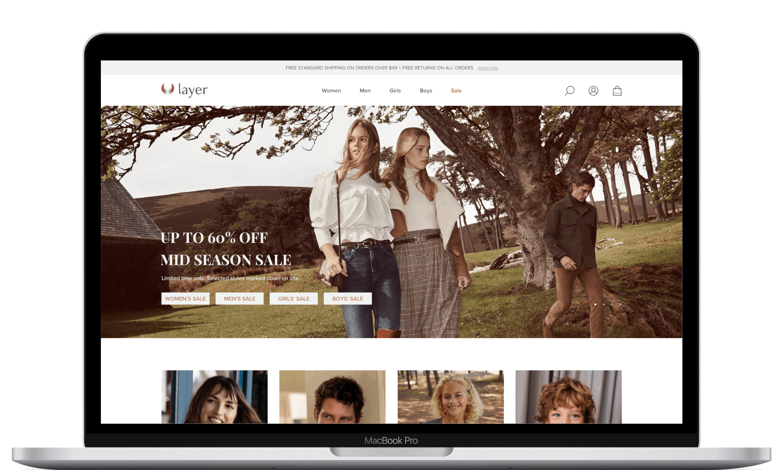
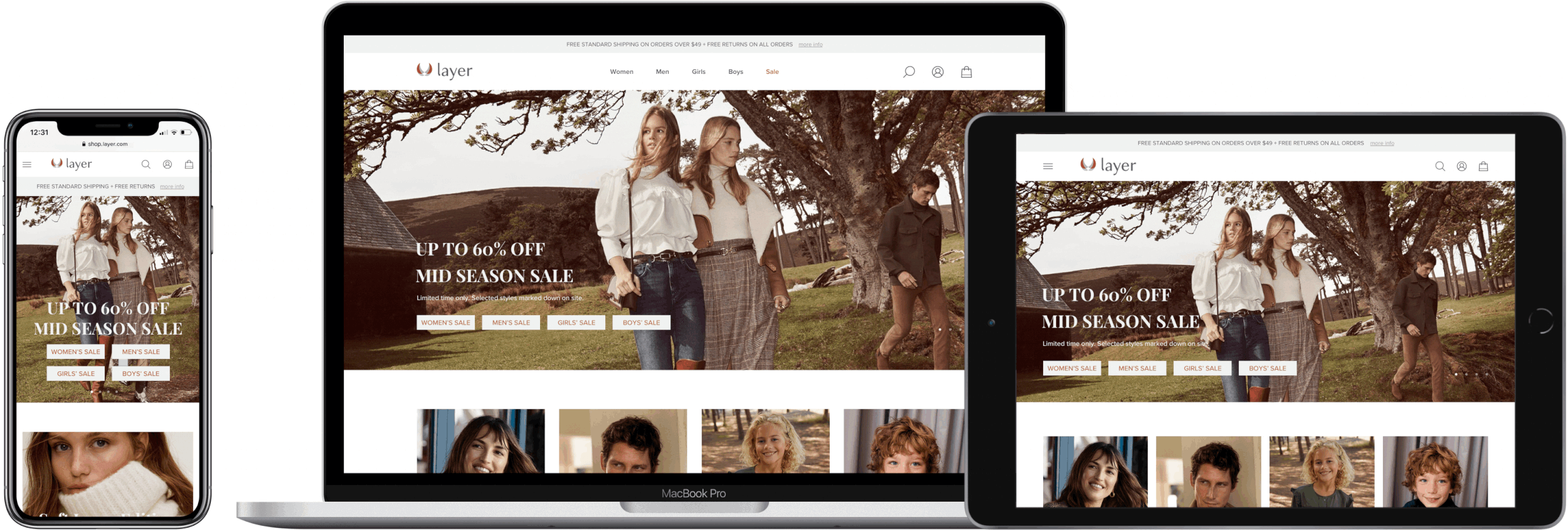
Responsive Hi-fi Wireframes
Initial solutions for desktop, tablet, and mobile.
After reviewing the overall layout and functionality of our design, we applied the simple, contemporary, and elegant brand style to our wireframes. With user needs and pain points in mind, our goal is to create a confident, efficient, and affordable shopping experience for our users, whether on desktop, tablet, or mobile.
With mobile and tablet traffic increasing significantly, our users also need to access Layer’s site on their handheld devices. Our users mentioned it’s hard to look at details of an item on their handheld devices due to the size of the screen. Thus they can’t get a sense of what the product looks like in real life to make a decision.
To reduce friction for handheld experience, we made sure the scale of product images is easy to read in both mobile and tablet versions. The CTA buttons and essential text are also designed with enough contrast for people to spot effortlessly.

5/ Testing and Iteration
Prototyping; Usability test
Does our design provide a confident and efficient shopping experience for user?
To test if our design provide a confident and efficient shopping experience for user, we observed how users interact with our prototype to browse, add and compare cloth.
🎉Success:
100% of the participants smoothly completed the browsing, adding and comparing tasks within five minutes.
Participants spoke positively of the website flow and functionalities.
Participants love the cleanness and sophistication of Layer’s UI design.
We also received valuable feedback to improve our hierarchy, features, wordings and design patterns.

Priority Revision
Improve our hierarchy, features, wordings and design patterns based on test findings.


The evolved design

What People Are Saying about Layer
“I like that I can rearrange items in cart so I can compare them more conveniently.”
— Shina, participant
I can quickly find everything I need to know about an item on this (Layer’s) website.
— Justin, participant
Layer’s style is simple, modern and sophisticated. It’s welcoming.
— Iris, participant


Reflections
Learning one: Always base the design on the research findings and the users. Before the Contextual Inquiry, I was sure our users would go to an e-commerce site, choose women/men, and start filtering options, but that’s not the case. All of our users went directly to the Sale page because they are very discount-driven. If I were to design based on only my thoughts, the flow would have been wrong.
Learning two: Users sometimes don’t know there is a problem, as a designer, you need to discover the pain points behind user behaviors. When our participants were showing me their comparing process, I noticed they have to scroll up and down multiple times to compare two items. They even had to pause our conversation. They never said a thing about this, but by observing them, we can find the little workaround they do to get the task done. After they have tried the “sort by” feature in cart, they were happily surprised that they can compare items in an easier way.

Next steps
For the next step, we are planning to do further usability tests to see if the evolved design has improved the shopping experience on Layer’s site. We especially want to see if the newly added review section helps users better visualize the fitting of the item; and if the “Sort by” button in cart is easier to use and will speed up the comparing process.
Given more time, we would like to design the user flow of checking out and tracking a return. Many users revealed that they don’t like typing in card info. “I might close the page and give up on shopping if the website doesn’t remember my card info.” Participants also felt insecure about returning items through the mail because they worry the item would end up missing. We are excited to solve these pain points for them.